Skull White: Pure White 9039 Chaos Black: Pure Black 9037 Scab Red: Mahogany Brown 9070 is closest (browner) or 9001 Red Brick (purpler). A mix of these would probably be the best of both worlds and match really, really close. Red Gore: Deep Red 9002 is close Blood Red: Clear Red 9094 Blazing Orange: Phoenix Red 9005 Fiery Orange: Clear Orange 9130 Golden Yellow: Marigold Yellow 9007 Sunlight Yellow: Sunlight Yellow 9008 Bad Moon Yellow: Clear Yellow 9095 Bilious Green: Spring Green 9146 Scorpion Green: Moth Green 9145 Goblin Green: Field Green 9167 is close Snot Green: Clear Green 9096 Dark Angels Green: Pine Green 9010 is close, or mix Swamp Green 9175 with some Clear Green 9096. Camo Green: Camoflage Green 9177 Catachan Green: Military Green 9176 Scaly Green/Jade Green etc.: The Reptilian Greens Triad 9184/9185/9186 Hawk Turquoise: Marine Teal 9077 is close Ice Blue: Mix Clear Blue 9097 with Pure White 9039 to match Lightning Blue: Sky Blue 9018 is close Enchanted Blue: Cyan Blue 9117 or Sapphire Blue 9016 are close Ultramarines Blue: Ultramarine Highlight 9189 Storm Blue: Ritterlich Blue 9115 Midnight Blue: Ultramarine Shadow 9187 Regal Blue: Brilliant Blue 9116 Nauseating Blue: Deep Amethyst 9079 Tentacle Pink: Close would be Pale Violet 9027 with a drop of white added Warlock Purple: Clear Magenta 9098 Liche Purple: Clear Plum 9132 Imperial Purple: Clear Purple 9099 Codex Grey: Rainy Grey 9038 Shadow Grey: Twilight Blue 9020 Space Wolves Grey: Snow Shadow 9021 is close Ghostly Grey: Ghost White 9063 Bleached Bone: Yellowed Bone 9143 Bubonic Brown: Tanned Leather 9031 Vomit Brown: Burnt Orange 9111; Leather Brown 9030 if you want it more brown Beastial Brown: Intense Brown 9138 Scorched Brown: Blackened Brown 9137 Snakebite Leather: Half-orc Highlight 9204 Leprous Brown: Saffron Sunset 9182 Vermin Brown: Chestnut Brown 9071 is close; a 50/50 mix of this and 9072 Rust Brown is close to perfect Rotting Flesh: Bloodless Skin 9150 is very close Elf Flesh: Rosy Highlight 9069 Bronzed Flesh: This color is very orange, and alarmingly close to Burnt Orange 9111; however, I prefer a more natural skintone, 9044 Tanned Skin, as a substitute for this one. If you want more warmth, mix 50/50 Tanned Skin 9044 with Golden Shadow 9091. Dwarf Flesh: Rosy Shadow 9067 Dark Flesh: Dark Skin 9041 would be closest. Add a drop of Ruddy Leather 9109 to deepen the color. Burnished Gold: New Gold 9051 Shining Gold: Antique Gold 9050 Dwarf Bronze: Ancient Bronze 9049 Brazen Brass: Tarnished Brass 9198 Tin Bitz: Scorched Metal 9125 Mithril Silver: Polished Silver 9054 Chainmail: Honed Steel 9053 Boltgun Metal: Shadowed Steel 9052 Newer or previously neglected GW Colors: Graveyard Earth: Uniform Brown 9127 is close, as is a 50/50 mix of 9161 Shield Brown and 9162 Driftwood Brown (though the latter is a little more grey) Kommando Khaki: Terran Khaki triad is close Fortress Grey: Misty Grey 9090 or Icy Grey 9174 may be close Terracotta: Terracotta Clay 9170 is close Desert Yellow: Dune Shadow 9154 is closest Tanned Flesh: Fired Clay 9171 is closest |
8001 Blood Red: Close to upcoming 9134 Clotted Red
8002 Firehawk Red: Close to 9005 Phoenix Red 8003 Dragon Red: 9003 Blood Red 8004 Ember Orange: 9006 Fire Orange 8005 Desert Gold: Close to 9074 Palomino Gold 8006 Spring Yellow: Close to 9009 Lemon Yellow 8007 Sunlight: 9095 Clear Yellow 8008 Elven Green: 9014 Forest Green 8009 Kilt Green: 9015 Grass Green 8010 Emerald: Close to 9016 Jade Green 8011 Plains: No equiv. 8012 Breonne Navy Blue: 9055 Breonne Blue 8013 Night Sky: 50/50% mix of 9152 Military Blue and 9080 Indigo Sky 8014 Dragon Blue: 9015 True Blue 8015 Ice Blue: No equiv. 8016 Imperial Purple: Close to 9023 Imperial Purple 8017 Liche Purple: Close to 9024 Amethyst Purple 8018 Rose Quartz: No equiv. 8019 Armor Grey: 9088 Stormy Grey 8020 Ash Grey: 9089 Cloudy Grey 8021 Granite: 9038 Rainy Grey 8022 Dove Grey: 9090 Misty Grey 8023 Walnut: 9136 Walnut Brown 8024 Woodland Brown: No equiv, closest to 9029 Earth Brown 8025 Volcano Brown: Upcoming 9179 Volcano Brown (June 2006) 8026 Chestnut Brown: 9071 Chestnut Brown 8027 Hill Giant Brown: Close to 9067 Rosy Shadow 8028 Buckskin: Close to 9075 Buckskin Pale 8029 Caucasian Flesh: Close to 9046 Fair Shadow 8030 Fair Maiden: Close to 9047 Fair Skin 8031 Ruddy Flesh: Closest to 9044 Tanned Skin 8032 Dwarf Flesh: No equiv. 8033 Orc Flesh: Close to 9036 Pale Olive 8034 Ghoul Gray: Close to 9148 Ghoul Skin 8035 Olive: 50/50% mix of 9034 Muddy Olive and 9035 Olive Green 8036 Bloodstone: 4:1 mix of 9077 Marine Teal and 9096 Clear Green 8037 Sea Floam: No equiv. 8038 Ivory: 9144 Creamy Ivory 8039 White Leather: 9062 Leather White 8040 Linen White: 9061 Linen White 8041 Dragon White: 9039 Pure White 8042 Dragon Black: 9037 Pure Black 8043 Oiled Leather: 9110 Oiled Leather 8044 Slate: Close to 9056 Templar Blue 8045 Pink: No equiv. 8046 Maroon: Bloodstain Red 8047 Slime: Closest to 9145 Moth Green 8048 Aged Red Brick: 9070 Mahogany Brown 8049 Troll Flesh: Close to 9034 Muddy Olive 8050 Hawkwood: Close to 9030 Leather Brown 8051 Ocean Blue: Close to 9116 Brilliant Blue 8052 Stone Grey: 9087 Weathered Stone 8053 Amethyst: 9079 Deep Amethyst 8054 Burnt Orange: 9111 Burnt Orange 8056-8057, No equivs. 8058 Pine: Upcoming Mist Green, 9168, due June 2006 8059-8062, No equivs. 8063 Glacier Blue: Close to 9018 Sky Blue 8064 and 8065, No equivs. 8066 Rust: 9072 Rust Brown 8067 Shield Brown: 9161 Shield Brown 8068 Blue Black: 9066 Blue Liner 8069 Bright Blue: 9097 Clear Blue 8070 Bright Red: 9094 Clear Red 8071 Bright Orange: 9130 Clear Orange 8072 Griffon Tan: Close to 9032 Amber Gold |
Thursday, October 25, 2012
paint conversion charts


a Colonial Marine painting tutorial
After posting about the Colonial Marine that I painted, I got a
few requests for a tutorial on how I painted him. Since I was looking
for one when I started, and ended up doing a bit of research on the
subject, I figured I’d make a tutorial myself. Probably spurred on by
the release of the new edition of Space Hulk, there’s a surprisingly
large number of people gaming the Aliens universe, so I hope this is of
use to someone. And even to those not painting Colonial Marines, this
tutorial details a simple way of painting a fairly generic scifi
trooper. Since I’m not a pro painter by a long shot, this tutorial
should be fairly easy to follow. There’s no wet-blending, NMM or fancy
stuff like that.
Throughout this tutorial you can click on photos to enlarge them in a new tab. As you’ll probably notice, the colours vary from photo to photo a bit. This is due to the fact that I shot the photos whenever I did some painting, meaning some were taken in bright daylight while others were taken in the middle of the night, not to mention using wrong camera settings etc. Photoshopping them all consistent would’ve been a huge chore, so I chose to live with them. I hope you can too.
Step one – Miniature
You can’t have a tutorial without a miniature to paint. As I posted earlier, I’ve picked Mark Copplestone’s scifi troopers (available from em4, Copplestone Castings and Mirliton) as my Colonial Marines. This particular miniature is a a trooper from em4.

Step two – Research
The second thing I did was look for reference material. It’s a surprisingly simple step that is often neglected. Simply by browsing pictures of what you’re about to recreate helps you immensely. With Google’s image search, this couldn’t really be any simpler. I simply typed in “colonial marine” followed by “armor/weapons/bdu/etc”. If you’re really lazy, you can just click here. The internet is full of people collecting movie props and replicas, which helps miniature painters to no end.
These are some of the (shamelessly plundered – will take down on request) pictures I went with:


Step four – BDU base colour
Next I painted the BDU (Battle Dress Uniform) with VGC (Vallejo Game Color) Khaki. Nothing special here, being neat helps.

Step five – Armour base colour
I then painted the trooper’s armour, armour straps and the pouches on his belt with VGC Cayman Green. As you may have noticed, what I’d interpreted as being the collar of the model’s BDU turned out to be a part of the armour. Probably. Don’t you just hate things like this?

Step six – Skin and hair base colours
Next came the skin, using Citadel’s old Bronzed Flesh. This is an old paint that I have, and I believe it might’ve been licensed from Coat d’Arms. The hair was painted with VGC Khaki.

At this point our trooper is starting to look something like an
actual, painted miniature, albeit a cheap, prepainted plastic one. Now
we start the fun(-ish) stuff, or in other words:
Step seven – BDU camo first colour
Painting camo tends to put people off for some reason. I don’t really understand why! It’s time-consuming of course, but it’s also really simple. I started with Citadel Graveyard Earth, and simply painted small irregular patterns/blotches on the BDU. I left fairly much empty space between the patterns, since I’d still need to squeeze in a second colour.


Step nine – Brown ink
To darken the armour a bit and to better bring out the folds in the BDU, I next gave the armour a thin coat of Citadel Brown ink and painted some of it in the cloth folds as well. The armor will usually look a bit messy. Don’t worry. It’s just a phase it’s going through.


Step eleven – Armour camo second colour
Next I finished off the armour camo by adding a second colour. The paint I used is an old Coat D’Arms one, and I have absolutely no idea of its name. It’s a darkish green, feel free to improvise to your own taste.

Step twelve – Armour weathering
A Colonial Marine’s armour is bound to get scuffed up a bit as he goes about the galaxy gunning down things, so my last step in painting armour was adding a little damage. I used Miniature Paints Chainmail, don’t know if you can find it anywhere. Any darker silvery metallic will do, though. I painted damage along the edges of armour as well as random scratches. Again the reference pictures are a great help.

Step thirteen – Skin shading
Since the skin was still flat at this point, my next step was to apply some Citadel Flesh Wash to the recesses, like between fingers, eyesockets etc.


Step fifteen – Highlighting the equipment
I have to make a confession here. I hate highlighting black, and am sick and tired of it, especially after these guys. Because of that, I really took an easy way out here, and simply highlighted every black item (weapon, headset, boots, gun holster, binoculars) on the Marine with Citadel Codex Grey and smoothed it down a bit with Citadel Black Ink. It’s quick and easy and delivers a good enough result. The same mentality went into highlighting the green ammo pouches. I mixed a lighter highlight colour from VGC Cayman Green and VGC Off White, and highlighted the edges. I didn’t want the equipment to be focal points in the mini, so I didn’t spend much time and effort on them.


Throughout this tutorial you can click on photos to enlarge them in a new tab. As you’ll probably notice, the colours vary from photo to photo a bit. This is due to the fact that I shot the photos whenever I did some painting, meaning some were taken in bright daylight while others were taken in the middle of the night, not to mention using wrong camera settings etc. Photoshopping them all consistent would’ve been a huge chore, so I chose to live with them. I hope you can too.
Step one – Miniature
You can’t have a tutorial without a miniature to paint. As I posted earlier, I’ve picked Mark Copplestone’s scifi troopers (available from em4, Copplestone Castings and Mirliton) as my Colonial Marines. This particular miniature is a a trooper from em4.

The unpainted trooper
The second thing I did was look for reference material. It’s a surprisingly simple step that is often neglected. Simply by browsing pictures of what you’re about to recreate helps you immensely. With Google’s image search, this couldn’t really be any simpler. I simply typed in “colonial marine” followed by “armor/weapons/bdu/etc”. If you’re really lazy, you can just click here. The internet is full of people collecting movie props and replicas, which helps miniature painters to no end.
These are some of the (shamelessly plundered – will take down on request) pictures I went with:
Colonial Marine BDU

Armour from Screamin’ Eagle studios (http://tinyurl.com/screagle), click for a larger version
Step three – Basecoat
Em4′s miniatures come ready with a grey
basecoat. While this is usually really helpful, I’m completely rubbish
at painting over anything other than a black basecoat. This was quickly
remedied with a touch of black paint.

Black basecoat added
Next I painted the BDU (Battle Dress Uniform) with VGC (Vallejo Game Color) Khaki. Nothing special here, being neat helps.

BDU painted VGC Khaki
I then painted the trooper’s armour, armour straps and the pouches on his belt with VGC Cayman Green. As you may have noticed, what I’d interpreted as being the collar of the model’s BDU turned out to be a part of the armour. Probably. Don’t you just hate things like this?

Armour painted VGC Cayman Green
Next came the skin, using Citadel’s old Bronzed Flesh. This is an old paint that I have, and I believe it might’ve been licensed from Coat d’Arms. The hair was painted with VGC Khaki.

Skin and hair painted with Citadel Bronzed Flesh and VGC Khaki
Step seven – BDU camo first colour
Painting camo tends to put people off for some reason. I don’t really understand why! It’s time-consuming of course, but it’s also really simple. I started with Citadel Graveyard Earth, and simply painted small irregular patterns/blotches on the BDU. I left fairly much empty space between the patterns, since I’d still need to squeeze in a second colour.

First BDU camo patterns with Citadel Graveyard Earth
Step eight – BDU camo second colour
In this step I simply repeated the procedure
of the previous step, using VGC Cayman Green. I tried to be as neat as
possible, and not have the two camo colours overlap. And just like that,
we have camouflage! As you might notice, for this picture I remembered
to flick on my camera’s correct settings.

Second BDU camo patterns with VGC Cayman Green
To darken the armour a bit and to better bring out the folds in the BDU, I next gave the armour a thin coat of Citadel Brown ink and painted some of it in the cloth folds as well. The armor will usually look a bit messy. Don’t worry. It’s just a phase it’s going through.

Citadel brown ink on armour and BDU folds
Step ten – Armour camo first colour
Checking the reference photos above shows
that there’s camo on the armour as well. The patterns are a bit larger,
so I took this into account. I used the same Citadel Graveyard earth
paint as on the BDU. Note that I didn’t paint any camo on the armour
straps.

First armour camo patterns with Citadel Graveyard Earth
Next I finished off the armour camo by adding a second colour. The paint I used is an old Coat D’Arms one, and I have absolutely no idea of its name. It’s a darkish green, feel free to improvise to your own taste.

Second armour camo patterns with dark green
A Colonial Marine’s armour is bound to get scuffed up a bit as he goes about the galaxy gunning down things, so my last step in painting armour was adding a little damage. I used Miniature Paints Chainmail, don’t know if you can find it anywhere. Any darker silvery metallic will do, though. I painted damage along the edges of armour as well as random scratches. Again the reference pictures are a great help.

Armour weathering with Miniature Paints Chainmail
Since the skin was still flat at this point, my next step was to apply some Citadel Flesh Wash to the recesses, like between fingers, eyesockets etc.

Skin shaded with Citadel Flesh Wash
Step fourteen – Skin and hair highlighting
I finished off the skin with a highlight of
Citadel Bronzed Flesh mixed with VGC Bone White, and the hair with a mix
of VGC Khaki and VGC Off White. I like my highlights very subdued, and
am not really a fan of the style of highlighting to pure white.

Skin and hair highlighted with lighter versions of base colours
I have to make a confession here. I hate highlighting black, and am sick and tired of it, especially after these guys. Because of that, I really took an easy way out here, and simply highlighted every black item (weapon, headset, boots, gun holster, binoculars) on the Marine with Citadel Codex Grey and smoothed it down a bit with Citadel Black Ink. It’s quick and easy and delivers a good enough result. The same mentality went into highlighting the green ammo pouches. I mixed a lighter highlight colour from VGC Cayman Green and VGC Off White, and highlighted the edges. I didn’t want the equipment to be focal points in the mini, so I didn’t spend much time and effort on them.

Black
equipment highlighted with Citadel Codex Grey and dulled down with
Citadel Black Ink, green equipment with lighter shade of base colour
Step sixteen – Finishing touches
Nearly there! I painted the eyes, based the
model (sand, Citadel Fortress Grey, Citadel Black Ink, drybrush with
Fortress Grey) and gave it a coat of gloss varnish followed by a coat of
matt varnish to take away the shine.

The finished model
And there you go! A happy little Colonial
Marine ready to die gruesomely in the hands of your extra terrestrial of
choice. I’d love to get feedback on this post. Of course, if you use
this tutorial, I definitely want to see the results!
That’s it. Game over, man, game over.
RUST
Luckily, Welf VIII. from this forum requested some in-progress shots
while I painted the miniature, so I can show you how I did the rust
effect on the skeleton's armour:
VGC=Vallejo Game Colour
VMC=Vallejo Model Colour
I always thin my paint with a 1:6 Mixture of Water/Future Floor Wax.
Step 1:
Metal parts primed white(!) sprayed over a black undercoat. I find it easier to define the general direction of light shining on the miniature.

Step 2:
VMC #828 Woodgrain (Transparent) wash over metal parts:

Sorry for the blurry pic...
Step 3:
First highlight using a 50/50 mix of VMC #828 and #851 Deep Orange. I applied the mixture as a wash. The trick with rust is that it works the opposite way that other materials. Liquids tend to collect in the deepest areas of a metallic object, so the lightest parts should be in the recesses. So it really should be called 'deeplight'...

Curses! Blurryness again!!!
Step 4:
I added some more orange to the mix and applied it to smaller areas deeper in the recesses:

Step 5:
Some VGC #38 'Scrofulous Brown' to give it a yellowish hue and VVMC #70815 'Basic Skintone' to make it more opaque was added into the mix:

...and a different view:

Step 6:
I added some metal areas where the rust has chipped off in order to break up the whole, erm, orangyness. I used VGC #54 Gunmetal and VGC #72053 chainmail for this:

Done!
VGC=Vallejo Game Colour
VMC=Vallejo Model Colour
I always thin my paint with a 1:6 Mixture of Water/Future Floor Wax.
Step 1:
Metal parts primed white(!) sprayed over a black undercoat. I find it easier to define the general direction of light shining on the miniature.
Step 2:
VMC #828 Woodgrain (Transparent) wash over metal parts:
Sorry for the blurry pic...
Step 3:
First highlight using a 50/50 mix of VMC #828 and #851 Deep Orange. I applied the mixture as a wash. The trick with rust is that it works the opposite way that other materials. Liquids tend to collect in the deepest areas of a metallic object, so the lightest parts should be in the recesses. So it really should be called 'deeplight'...
Curses! Blurryness again!!!
Step 4:
I added some more orange to the mix and applied it to smaller areas deeper in the recesses:
Step 5:
Some VGC #38 'Scrofulous Brown' to give it a yellowish hue and VVMC #70815 'Basic Skintone' to make it more opaque was added into the mix:
...and a different view:
Step 6:
I added some metal areas where the rust has chipped off in order to break up the whole, erm, orangyness. I used VGC #54 Gunmetal and VGC #72053 chainmail for this:
Done!
How to paint Ensignia
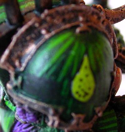 Ensignia are surprisingly easy to paint. I've done it pretty much the same way for years.
White Dwarf occasionally has articles about it but I've distilled the gist of it to this
very page. I'm a bit dismayed that even with so so light my camera managed to take
extreme close ups that make my painting look a bit sloppy which really isn't the case. The
Ensignia in question is a campaign badge from my
Vancouver GT Army. It is perhaps
a centimetre wide and about a half centimetre high.
Ensignia are surprisingly easy to paint. I've done it pretty much the same way for years.
White Dwarf occasionally has articles about it but I've distilled the gist of it to this
very page. I'm a bit dismayed that even with so so light my camera managed to take
extreme close ups that make my painting look a bit sloppy which really isn't the case. The
Ensignia in question is a campaign badge from my
Vancouver GT Army. It is perhaps
a centimetre wide and about a half centimetre high.
Paint it Black
 The first step is generally to paint the shape of the ensignia in black. In this case I
wanted a rectangular patch. I intended to paint three stylized letters on it eventually. I
used a size zero brush for everything including the letters. All paints are GW, but most
are out of print.
The first step is generally to paint the shape of the ensignia in black. In this case I
wanted a rectangular patch. I intended to paint three stylized letters on it eventually. I
used a size zero brush for everything including the letters. All paints are GW, but most
are out of print.
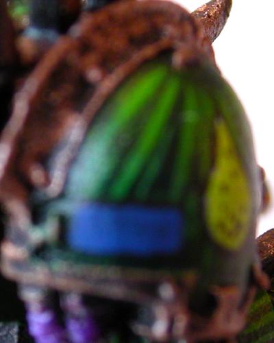
Paint it Blue
 Depending on the color you want your ensignia you may have to paint white on top of the black badge.
The chapter badge was done this way, you can even see tiny specks where I missed painting
green over the white. The goal with this coat is to leave an outline of black around the
shape. So in the previous stage you should paint your black shape slightly bigger then
you need. For this coat I used Moody Blue, possibly from the original Monster Paint Set.
Depending on the color you want your ensignia you may have to paint white on top of the black badge.
The chapter badge was done this way, you can even see tiny specks where I missed painting
green over the white. The goal with this coat is to leave an outline of black around the
shape. So in the previous stage you should paint your black shape slightly bigger then
you need. For this coat I used Moody Blue, possibly from the original Monster Paint Set.
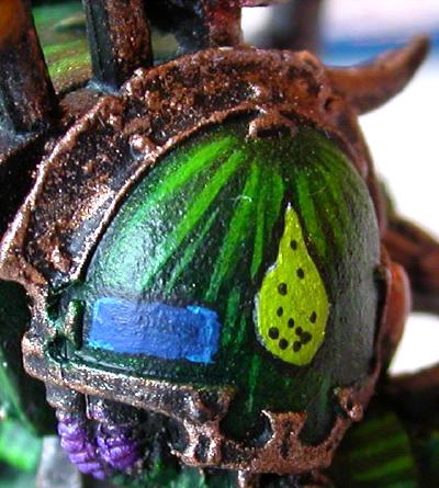
Paint it Bluer
 For this ensignia I wanted to give it highlights on the edges, I've done some experimenting and
for rectangular shapes it is best to just highlight the corners. This requires two tiny lines
per corner. It isn't that hard. You can paint on top of the previous blue and if you paint a
bit on the black too, it doesn't matter, it'll look fine.
For this ensignia I wanted to give it highlights on the edges, I've done some experimenting and
for rectangular shapes it is best to just highlight the corners. This requires two tiny lines
per corner. It isn't that hard. You can paint on top of the previous blue and if you paint a
bit on the black too, it doesn't matter, it'll look fine.
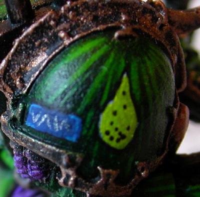
Lettering
Some people seem to advocate using graphing pens to do ensignia and lettering. I am not of that school. I have tried it and it works fine for banners. However for curved surfaces like this shoulder pad and if you want your lettering to be a different color such as silver the graphing pen technique is not so effective. For these badges I used stylized letters which are all slanted lines. I have no horizontal or vertical lines, it makes it look different.Making a Dark Eldar webway portal

Since the GW webway portals can be hard to come by, I decided to try my hand at making a Dark Eldar webway portal at the prompting of Mr. Esty from Enter the Nurgling.
...These have to be easy to recreate at home on our own, no? Isn't it just a painted dome?
What do you think of doing a tutorial, or a how-to-make your own article?
It just seemed like something you'd be good at (I've never tried painting any lightning FX myself before).

Image from Games Workshop
Well, he's right, they aren't too hard to make it turns out. While you could pick up the GW version (or you may already have it since it bears a striking resemblance to another well known template) there is always the option of making your own version.
So I set out to see what I could do.

The first step was finding a suitable "thing" that I could use to make the actual template. I had a rough idea of what I was looking for and it only took me a day to find it. Turns out, an official plastic Wiffle ball is just a couple millimeters short of 3 inches (the width of the GW version I'm told). Half of the Wiffle ball has holes in it and the other half is solid... guess which half we need for our project.
Now you purists might balk at the very slight size difference, but I think for most people, this won't be an issue at all.
In addition to the Wiffle Ball, you're going to need a few other things to pull this off.
X-Acto blade
Hobby file(optional)
Spray paint (Black, White and two colors that match your army)
White paint and detail brush
Clear Gloss finish (optional)
Gloves (to protect your hands during painting)
Once you have everything, it should only take about a half hour (including dry time) to make one. And I'm sure you can always make a couple of these at once as well to cut down on your time. So let's get to it then.


Getting it cut in half was easy to do. Since the ball is plastic, it's easy enough to follow the seam around the middle of the ball with an X-Acto knife and cut it right in half. Some cleaning up around the edge and you've got your template. Now there is the issue of the molded text on the ball.
While the text is small and not very obvious, it still has to go. We can't have that junk on there. This can be CAREFULLY shaved off with your X-Acto blade (hold it sideways) and then use a bit of a scraping (similar to cleaning mold lines) once you have the majority of the text cleared away. This concludes the construction portion of the tutorial.
With your "template" ready to go, it's time to get to painting.
This is where the gloves come in, so you don't end up spray painting your hands while you're working.

NOTE: I picked two colors I thought looked cool. You can use Black, White and any two colors that suit you and match your army. You obviously don't have to use the two blues that I chose here. The important part is that you get two colors... one light and one dark. And I use the cheap spray paint too.

First we prime the thing black. Make sure to let this dry completely before moving on. I told you we would need gloves.

Once you have it primed, it's time to do the real painting. You may want to try a few practice runs on some cardboard lying around just so you aren't surprised and you get the effect/shape you're looking for when you go to paint the real thing.
The picture above breaks the template down into three areas.
It also goes in order... A,B and then C.
A: Where you paint the highlight using your lighter color. Just a quick spray or two like you see in the picture.
B: The area where you paint all the way around the template with your darker color. The idea is to help blend the lower portion of your light area into the black at the bottom.
NOTE: You may want to go back with your lighter color after step B and put a tiny highlight back on the template. You can go back and forth between A and B until you have the look you want. Just make sure to let each step dry completely before spraying.
C: The bottom where you add the black. You actually paint just below the template (hence the gloves) and let just a little bit of the spray cover the very bottom edge of the template. The idea is to get black at the bottom without covering too much of your work on top.
With these three steps done, set it aside to dry before adding the lightning.
Adding the lightning is done in two parts.
1. Get your white spray paint and a scrap of cardboard (remember that piece you used to test out your patterns on?) and make yourself a puddle of white paint. Quickly take your gloved finger and get some paint on it and then flick your finger at your template.
Once again, you might want to practice this a couple times before the real thing to make sure you get the right amount and pattern you want.
With everything completely dry, take your regular white paint and a detail brush and go in and add a variety of squiggly lines radiating out from some of your larger drops of white paint. This will make the lightning look like it's concentrated in some areas and not in others. Add lightning "bolts" until you have the desired effect.

Give it a quick gloss varnish and you're all set. I chose the gloss over flat so the piece would stand out on the tabletop a little better. It will most likely be the only high gloss piece on the table and that will help better represent the ethereal warp like quality it should have.
You can see how it looks compared to a regular 25mm based marine there.
All in all, a fairly easy process with some good results. And even better is the fact that you can use colors to make it match your own army.
While it looks like I just threw this together real quick and it came out great looking, it took me a number of attempts (read at least a dozen) to get it this way. If you're going to try this, please do yourself a favor and do a few trial runs on the side of a box or something before putting any paint on your template.
Horsemans Diner - a WIP
I was hoping that this week’s blog would be
showing a completed model, but alas things have conspired to delaying
the finishing of this particular project, so it has unfortunately become
yet another work in progress ! I was also hoping to get
this blog out yesterday (I’m trying to make a Saturday my target posting
day), but again real-life and she-who-must-be-obeyed held sway on that
idea.
Some of you will no doubt recognise the
signage of my Diner, being very similar to the free “Horseman’s Deli”
(from “Microtactix” - http://www.microtactix.com/) that can be found on
the internet. A bit of jiggery-pokery on Photoshop and the “Horsemans Deli” became the “Horsemans Diner”.
I
always liked the look of this building but I wanted something a bit
different from everyone else’s Deli; you have no further to look than
Vampifan's rendition of the Deli to see what the original was intended
to look like.
 |
| Parking is at a premium in these parts. |
The first photograph shows the general
overall view of the diner with some of my latest vehicle acquisitions
(picked up today for 10p each !). The overall footprint of the Diner is
9” x 9” (22.5cm x 22.5cm approx) , with a height of 3” (7.5cm) to the top of the rooftop parapet which is approximately ½” (1.25 cm) tall.
 |
| Notice the glaring mistake ? |
This photograph is merely a close-up of the
front of the Diner, I had to redo the front doors and enlarge the door
frames to make a better “hinge”; all the doors in the Diner are
openable.
Notice that my photography skills haven't improved and I'm still getting glare on the windows.
 | |
| The boring back which needs trash cans posters etc. |
This picture is of the back of the Diner, nothing spectacular here, but note that the inside floor of the diner still has to be removed from the outside !
The next two views show the inside of the
diner from the front. The fixtures and fittings in the model are only a
temporary measure and aren’t glued in place or necessarily what will
appear in the finished model. They’re there just to
illustrate what the final product may look like, if and when I ever get
it finished, most of the fittings are from World Works Games. I have
posters, menus, tables, more benches and other fittings to put into the
model, along with a couple of posters for the outside walls to bring the
model to life so to speak.
 | |
| Overall view, the toilet is in the dark top right corner |
 | |
| Close up of counter, seating and kitchen |
The last two views are from the back of the diner, showing the kitchen area, nothing spectacular here.
 |
| I need twice the bench seating shown and tables ! |
 |
| Kitchen area, a few more fittings still needed here |
Subscribe to:
Posts (Atom)